Matt Lambert, Designer • February 02, 2026
Seeing Complexity for What It Is
When I first stepped into the security space, the thing that stood out was how overwhelming many tools were. Platforms often present everything at once, assuming the user already speaks the language of security. It creates an environment where only the most experienced analysts can navigate effectively and everyone else is left guessing. That observation became the starting point for the Kenzo approach. If the market is full of dense and intimidating products, then clarity can become a strategic advantage.
Part of the overwhelm comes from the mental load analysts face every day. They are expected to track thousands of events, understand unfamiliar patterns, pivot across multiple tools, and constantly decide what deserves attention. Many interfaces make this harder by forcing users to decode dense layouts, scattered information, or long lists of alerts that look identical. Even simple questions such as where a signal originated or whether something is still active can require unnecessary searching. The cognitive load grows quickly and the cost of a wrong assumption can be high.
This raised an important question for us. Who is the dashboard really for? Some users need high level reassurance. Others need a path toward deeper investigation. Executives want to understand overall posture and trends. Operators want clarity on what happened and what they should act on next. The experience should feel approachable for both without diluting the needs of either group.
The goal is not to simplify the work but to reduce unnecessary friction. A dashboard should teach the user where to look next and remove the mental overhead that usually surrounds security tools. Clarity becomes a practical advantage when the environment itself is already complex.
Complex Dashboard
Cognitive overload, the user is unsure where to even begin.
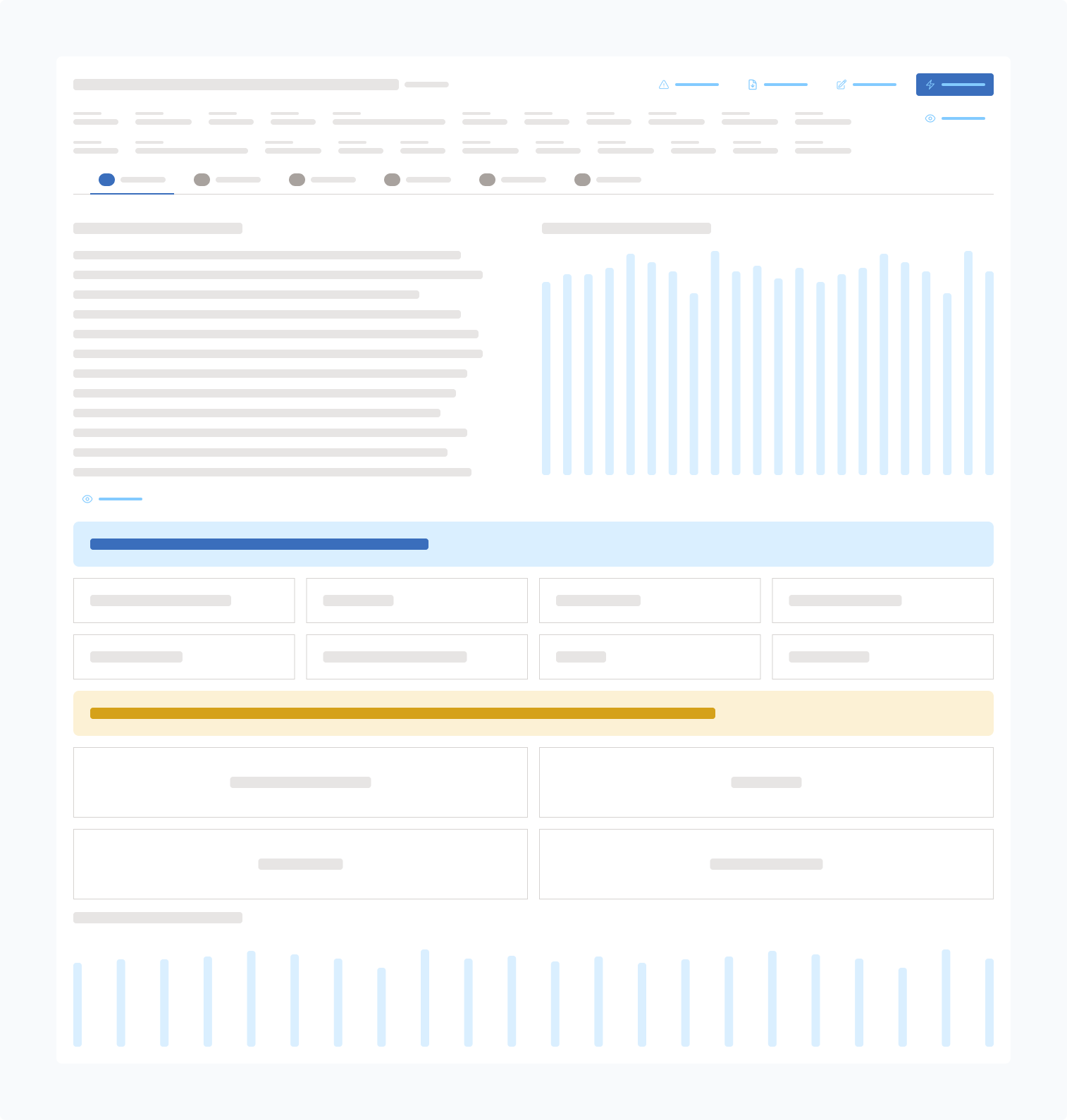
Kenzo Dashboard
User understands the flow of data immediately and how to act.
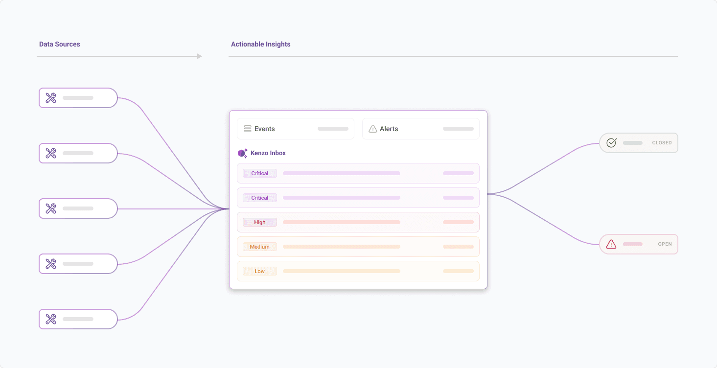
When a user lands on the page, the connected services appear first so they immediately understand the sources feeding Kenzo. The event and alert counts in the center give a quick sense of scale, which helps both leaders and analysts understand the current state without effort. The open and closed alert summary on the right naturally suggests priority. As they scroll, the interface shifts into actionable information. Risk based insights point to the identities or assets that need review. The list of open alerts shows active issues. The common alert types reveal patterns that may require investigation or tuning. The sequence builds orientation for executives while still giving operators a clear entry point into deeper work.
Reduction as a Core Strategy
A key principle behind our design work is the idea that not all information deserves to be surfaced at the same time. Security generates chaos and noise. The interface should not add to it. Instead of pushing every metric, event, and log in front of the user, we adopted a reduction strategy that sequences complexity. The user begins with a clear snapshot of what matters now. Only when they choose to go deeper does the system reveal the next layer. This creates focus. It also supports a broader audience that includes business leaders, junior analysts, and anyone who needs fast situational awareness.
This approach is not unique to security. Many of the most successful products in adjacent fields embrace reduction as a way to support clarity. Apple’s design philosophy is a common example. The iPhone presents only the essential actions on the surface and hides complexity behind deliberate layers. Users never feel punished for not knowing where something is. The experience scales from novice to expert because the starting point is simple and predictable. In contrast, platforms that emphasize unlimited choice often create confusion. Features compete for attention. Options become noise. The friction increases even when the capabilities are powerful.
Reduction works because it respects the reality of human attention. People do not navigate complexity by absorbing everything at once. They move through it step by step. By removing unnecessary decisions early and revealing depth only when requested, the product feels easier to use without limiting what it can do. In security, this is especially important because the cognitive load is already high. A reduction strategy gives the user room to think, which is often the most valuable thing in an environment that generates constant noise.
Guided Depth Instead of Overwhelm
This approach evolved into a structure we call guided depth. Every artifact in Kenzo begins with a stable overview that lets the user understand where they are before they move anywhere else. Alerts, events, telemetry, entities, and detections all follow this same pattern. It creates predictability in a domain that often feels fragmented and chaotic.
A guided approach matters because investigations can easily become overwhelming. Many security tools drop analysts straight into large tables or dense technical outputs and assume they know what to do next. This creates disorientation. Analysts end up jumping across tabs, running queries out of order, or chasing details that are not relevant to the determination. Guided depth solves this by having a clear opinion on what the user should see first and then letting them branch outward once the foundation is set.
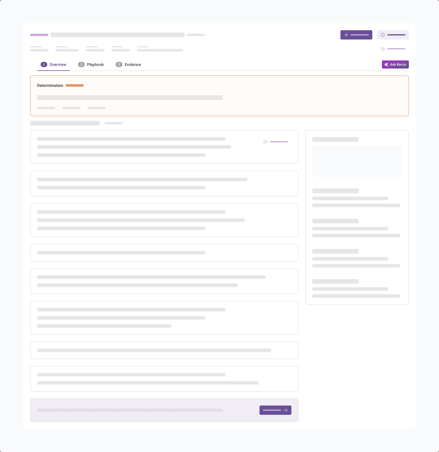
In Kenzo, this takes the form of a three part investigation experience. The first step is the overview. The analyst sees the determination, a high level summary in plain language, supporting context, and controls for giving feedback that can improve future accuracy. They can also leave comments for their team so the investigation remains transparent and traceable. Once that grounding is in place, the user moves into the playbook. This section shows the specific queries that were run and whether their outcomes were suspicious or benign. It creates structure around the investigation so analysts do not have to guess what checks were performed. The final step is evidence. This is where the deeper layers live, including graph views, timelines, event tables, related alerts, threat intelligence, and action history. Users who need full detail can access it without losing their orientation.
Guided depth keeps complexity in the right order. The user sees the critical information at the moment they need it, and only then do they reach the heavier layers. The structure gives analysts a sense of control and makes investigations more repeatable, even when the underlying data is complex.
Readability as a Competitive Advantage
Readability became another foundational choice. Many enterprise products assume more density equals more credibility. We took the opposite approach. Clear spacing, larger type, deliberate grouping of content, and visual breathing room all support stronger comprehension. These decisions give the user a sense of calm, which is essential when they are dealing with high stakes issues. A readable interface improves comprehension and reduces errors. It also makes the platform more approachable for people who do not spend their entire day inside a SIEM. The visual direction leans on Swiss minimalism to establish a calm and structured foundation that supports clarity throughout the experience.
Practical AI in the Workflow
AI is everywhere in security but it is often added as a surface level feature. Many products treat it as a companion that sits on top of the interface and interrupts the user with suggestions they did not ask for. These approaches rarely help because they create friction. They ask the user to change their behavior instead of fitting naturally into the moment of work. The more realistic and useful role of AI in design is to support the existing flow. It should feel like part of the environment, not an extra layer the user has to manage.
In Kenzo, the AI is intentionally invoked. During an investigation, users can ask natural language questions when they need clarity. They can generate or refine detection rules based on what is happening in context. They can provide feedback so future alerts become more accurate. AI is present, but only when the user wants it. This avoids the problem of ever present copilots that hover like Clippy and disrupt the task at hand.
There is also a second layer that operates quietly in the background. AI helps shape what information is surfaced and when. It adjusts the context panels, highlights the signals that matter most, and reduces noise without drawing attention to itself. The user does not need to understand the full architecture behind these decisions. They simply feel the effect in the form of clearer investigations and faster comprehension.
The goal is to support analysts, not to impress them with AI for its own sake. When used in the right places, AI accelerates the workflow and strengthens confidence. It becomes a practical part of the investigation experience rather than a gimmick. Kenzo uses it to improve orientation, reduce noise, and help users reach the right conclusions with less effort.
Containment as a Design Requirement
During the investigation design work we encountered a recurring problem. Security data expands quickly. Without careful containment the interface turns into a sprawl. We made conscious choices to keep users anchored. Side panels were used to reveal more context without removing the user from the primary view. Context remained tethered to the original artifact. Movement felt linear even when the information was multidimensional. Containment is subtle but powerful. It keeps users grounded while still giving them access to deeper layers when they need them.
Clarity in How Artifacts Relate
Another challenge was organizing and presenting the relationships between alerts, events, and entities. Security data can form complex networks and dependencies, and it is important to expose that power without overwhelming the user. To support this, we built a layered approach. The primary experience leans on consistent tables, clean grouping, and predictable labeling so users can build a solid mental model. As they move deeper, more advanced views become available, including graph based tools that reveal how artifacts connect beneath the surface.
These expert level tools are intentionally placed at the lowest layer of progressive disclosure. Users who need them can access a richer, more interconnected picture of their environment, while everyone else can operate confidently within the simpler views. This balance maintains clarity for the majority of users while still giving analysts the depth they expect.
The Outcome of a Clear Philosophy
Kenzo’s UX is not about showing less. It is about showing the right thing at the right moment. Reduction removes noise without removing capability. Guided depth creates confidence without limiting power users. Practical AI enhances real workflows. Readability brings calm to complicated environments. Containment keeps orientation stable. By combining these principles, we shape a platform that reduces friction and respects the way people think.
Clarity is not the absence of complexity. Clarity is the ability to move through complexity with confidence. That is the direction we continue to follow. Schedule a demo with us today.
